StudyWise
StudyWise is an AI-powered platform that helps educators generate customized exams from uploaded materials. During my time as the platform’s UI/UX designer, I redesigned the exam creation workflow to make it clearer, faster, and more intuitive for teachers creating assessments.
The original workflow lacked structure and made it difficult for users to understand how their materials would translate into an exam. My goal was to redesign the experience into a guided, step-by-step flow that gives users more control and clarity while reducing cognitive load.
User Interface / User Experience
Problem
As people age, maintaining meaningful social relationships becomes both more challenging and more important. Older adults are disproportionately affected by social isolation and loneliness—conditions linked to increased risk of depression, cognitive decline, and premature mortality. Yet most mainstream platforms often rely on small touch targets, frequent UI changes, and nested menus that overlook older adults’ needs. This disconnect is not rooted in older adults’ lack of interest or capacity but in design choices that overlook their needs and preferences.
Understanding the User Journey
I first mapped the end-to-end exam creation journey to understand where friction occurred:
The user flow involved:
Uploading teaching materials
Selecting exam preferences
Generating questions
Reviewing the final exam
Mapping this journey helped identify moments where users experienced confusion, lack of feedback, or decision overload.
Competitor Analysis
insert
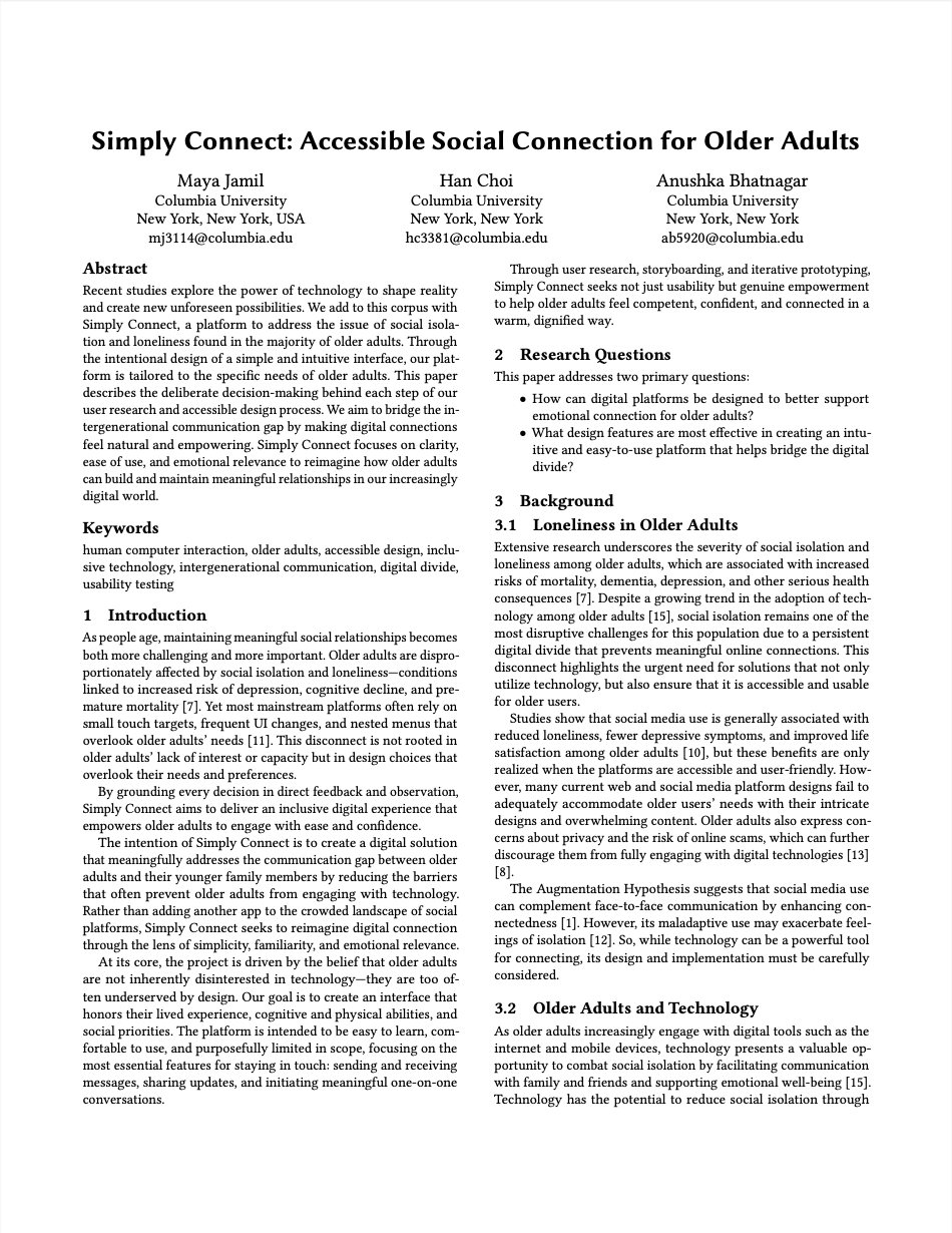
Identifying Pain Points & Affinity Diagramming
Key themes emerged:
Lack of transparency
Users couldn’t easily understand what the system was doing with their uploaded materials.Overwhelming interface
Too many options appeared at once without clear guidance.Limited customization
Teachers wanted more control over question types, difficulty levels, and exam structure.No clear confirmation step
Users had no way to review their selections before generating the exam.
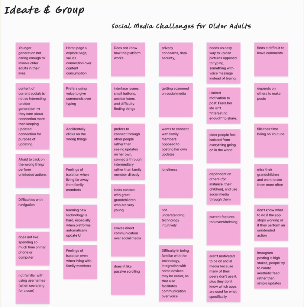
Analysis of Affinity Diagram Insights
We organized our data from contextual inquiries and secondary research into an affinity diagram. By grouping similar comments and observations, we were able to spot the following recurring themes
Digital Interfaces and Overwhelm: cluttered layouts, small touch targets, and frequent UI changes eroded confidence and hindered basic navigation.
Privacy and Security Concerns: fear of scams or accidental posts discouraged personal sharing.
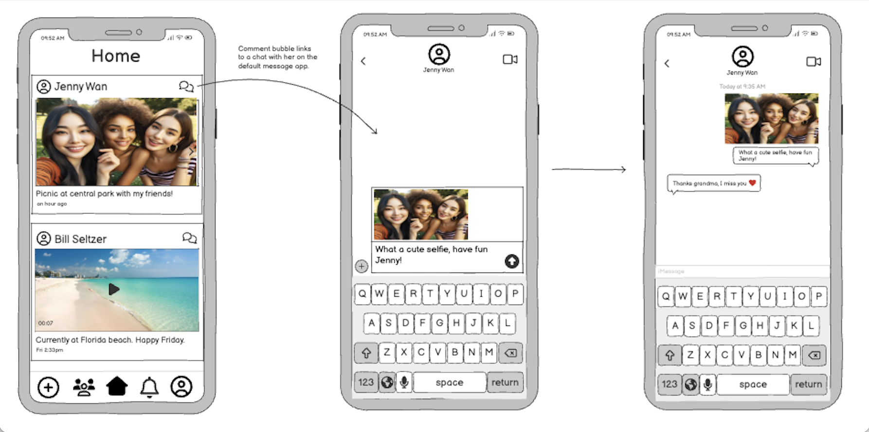
Loneliness and Isolation: mainstream platforms offer surface contact but rarely enable the meaningful conversations participants sought with grandchildren.
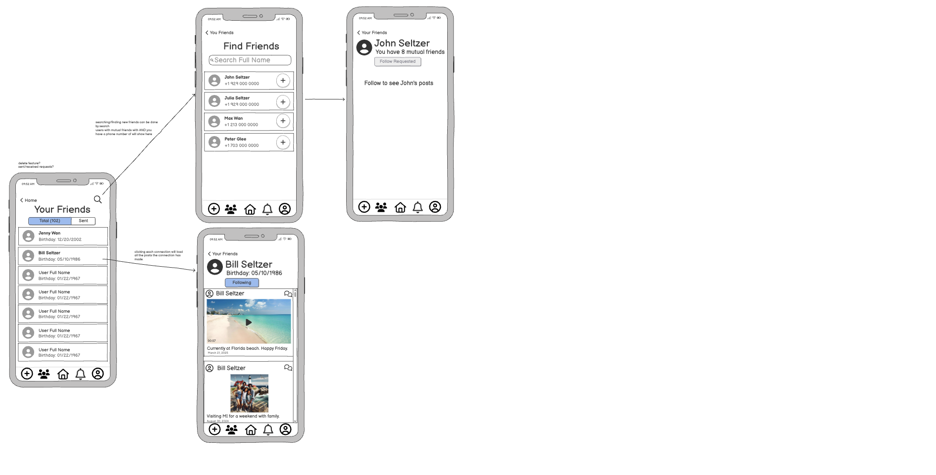
Dependency on Others: posting, photo uploading, and troubleshooting still require younger relatives, limiting autonomy.
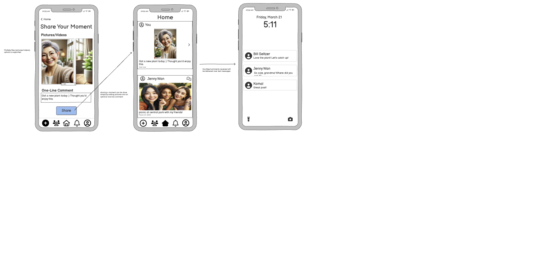
Limited Motivation to Share Content: daily life was deemed “not interesting,” and composing updates felt tedious, leading participants to remain passive consumers
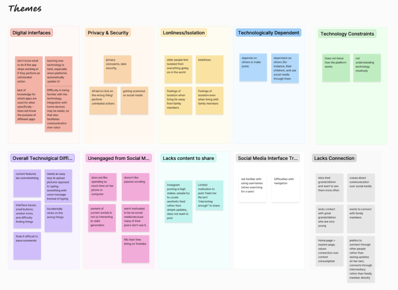
Journey Mapping
Next, we constructed 3 different journey maps to outline a step-by-step account of how older adults interact with social media. This approach helped us capture not only the sequence of actions (e.g., signing up, posting updates) but also the emotional responses and technical stumbling blocks at each stage. Journey mapping revealed moments where connection could happen but didn’t, often because older adults didn’t know how to engage.
Journey Mapping Insights:
Revised Problem Statement
🔍 Problem
While StudyWise promises to streamline exam creation, users feel bogged down by a process that doesn’t match their mental models or teaching context. Our research shows that teachers want to reuse, revise, and build assessments in ways that mix AI with their own materials — not follow a rigid sequence with unclear steps and low-value features. The result is a loss of trust in the system’s ability to actually save time.
💡 Vision
We aim to design an exam builder that supports real educator workflows: modular, flexible, and co-creative. Teachers should be able to jump in at any point — reuse content, generate from scratch, or collaborate with AI — while always knowing where they are, what happens next, and how their choices impact the final result.
🎯 Need
A more intuitive, modular UX won’t just reduce friction — it builds trust in the product’s ability to support educators long-term, especially under pressure.
Ideation
Paste ideation table here
Wireframing
Made decision to focus on these problems, created ideas for them
After ideation, created high-fidelity Figma wireframes.


Final Prototype
Paste figma link here
Conclusion and Future Work - make relevant for StudyWise
Key takeaways:
Simplicity empowers confidence.
Emotional connection does not require complex interaction.
Familiar tools (existing messaging apps) help reduce learning barriers.
Flexibility is critical — not all users want the same frequency or type of interaction.
Accessibility must be baked into every stage of design.
Future work will focus on:
Onboarding and tutorial flows
Content personalization options
Voice interaction support
Broader user testing across diverse older adult populations
Building a functional MVP to test long-term engagement
Reflection:
This project taught me that accessible design is not just about interface—it’s about dignity, confidence, and emotional connection. Designing for older adults requires us to rethink assumptions and deeply understand user contexts. Simply Connect allowed me to explore how intentional simplicity can create more meaningful and empowering digital experiences.